

A refreshing twist on popular boozy beverages.


Overview
Five O' Pops is a fictional brand introducing a fun and refreshing take on classic summer bubblies. With real fruit flavors and a little bit of fizz, our icy treats will transform any home into happy hour!
Project objective
Develop a unique brand identity and package design experience that clearly articulates the essence of the products and embodies the brand's mission.
deliverables
Brand identity & style guide
Physical package design prototypes
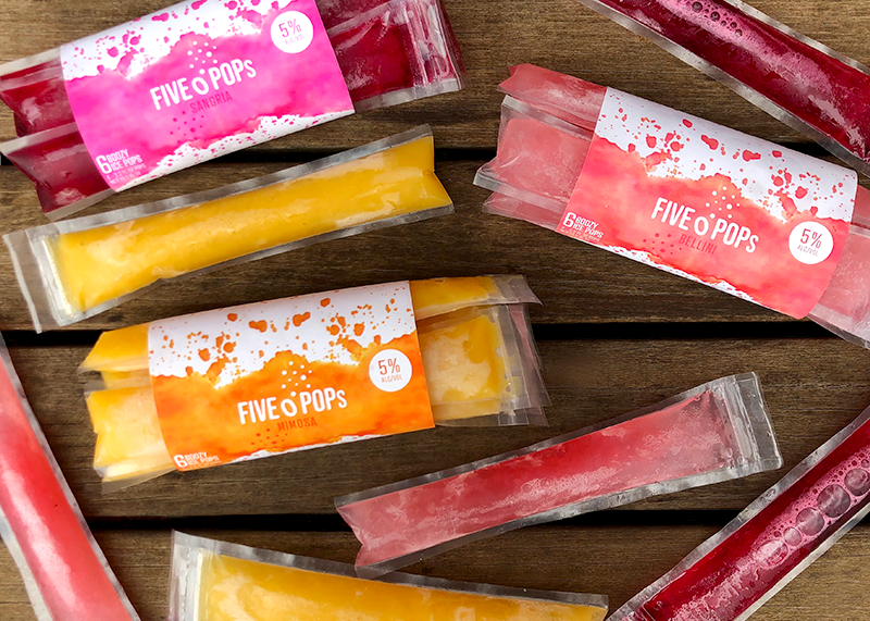
Product photography
Process
Typeface exploration
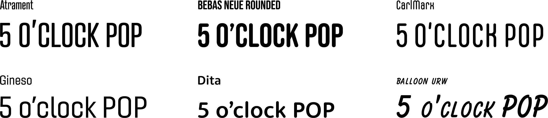
I began by exploring typefaces characterized by rounded edges and soft forms, aiming to capture the fun and playful vibe of the brand.
Logo iterations
The initial iterations integrate iconography inspired by the product, such as ice pop shapes and cocktail umbrellas. While fun and playful, this approach is too literal and lacks a strong typographic connection between elements.


The second round of iterations experiment with more abstract forms, like bubbles, to convey key elements of the product such as the alcohol content. In this iteration there is still a disconnect between the iconography and typography.


The final iteration integrates typographic and design elements from earlier iterations into a cohesive composition. The logo’s versatile form ensures suitability across various scales and color applications, essential for a flexible brand identity and package design strategy.
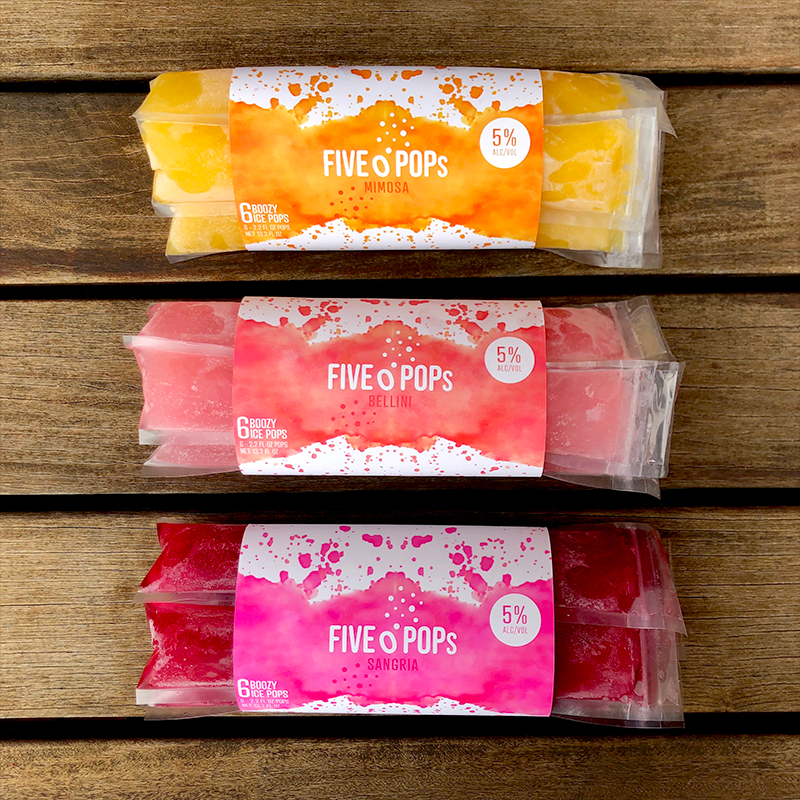
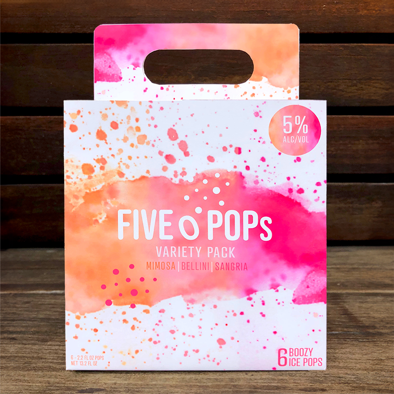
Packaging design
The initial iteration maintains the familiarity of classic ice pop packaging with a unique twist on the exterior box packaging. The ice pop box is inspired by traditional 6 pack beer cases to further showcase the alcoholic element of the product. While the packaging concept is strong, the design execution is bland and lacks contrast. The feedback I received on this iteration was to explore more dynamic textures and colors to evoke the funa and playful personality of the brand.
The final iteration applies the above feedback by incorporating more dynamic compositions with expressive color washes. The various packages highlight different elements of the brand identity to create a unified packaging experience. In addition, the packaging includes important information required by the FDA including nutrition information, alcohol content labels, and UPCs.
Style guide
Reflection & INSIGHTS
Key learnings
Packaging design relies on thoughtful consideration of all design details, big and small. Each element of the design informs the overall product experience. Beyond brand identity and product execution, product photography is crucial to communicating a compelling brand story. It enables consumers to visualize how they will experience and consume the product.
Skills Developed
Brand identity development
Creative copywriting
Packaging design
Product photography